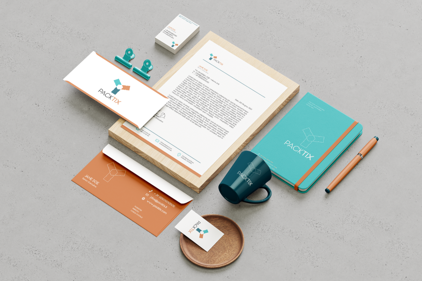
Packtix is the business unit of a rapidly growing B2B tour operator, specialized in group air ticketing for the leisure and MICE segments, and stands out for its competitiveness, operational efficiency, and highly specialized consulting services.
The concept behind the name is very simple and straightforward: “PACK” refers to the group and the possibility of purchasing ticket packages for your clients. “TIX” obviously refers to tickets.
Logo Design
For the logo, I focused on competitiveness, operational efficiency and specialized consulting, professionalism, dynamism, and reliability.
When thinking of a group, the idea of something solid, united, and trustworthy immediately made me think of the classic gesture of stacking hands together in the center — in this case, however, holding an airline ticket. I started from this overlapping gesture and played with the shapes, eventually arriving at a hexagon, a symbol of efficiency and stability.
On the side are the proportions of the two versions of the brand mark.
Color Palette
A color palette that combines freshness and innovation (turquoise), energy and enthusiasm (burnt orange), professionalism and solidity (petroleum blue), with cleanliness and transparency (white), and elegance and clarity (black).